If you go to lunch with a dozen of your co-workers, and ask them what they think is at the heart of the variation in district funding, I bet you’d hear a dozen answers. Some would say: “Wealthier communities fund their schools better.” Someone else would say: “Districts with more kids who are harder to educate get more money. Another might reply: “There’s not that much of a difference.”
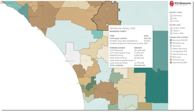
In the interest of bringing better evidence to this important conversation, our School Wise Press K12 Measures team has built this digital map showing district funding for 2018 from all sources: federal, state and local. The average funding across all three sources for all districts is about $12,700 per student. (Technically, we are counting a “student” the same way the Calif. Dept. of Education does, on a per-average-daily-attendance basis.)

Funding disparities among districts in San Diego area. Map shows total revenue-per-ADA for 2018. Click here or on the map to go to the “live” version and explore. There you’ll find all districts in California. If you prefer, start the map on southern California or northern California.
Our method was to divide all districts into nine barrels of about 100 districts each, and then cluster those nine into three groups: those in the middle (average), those higher than average, and those lower. Those in the middle are assigned the lightest colors. Those higher than average are green. Those lower than average are brown. The darker the color, the farther from the average a district’s funding sits.
Here a suggestion about how to look at this map, and make sense of what you see….
Using the navigation tools in the upper left corner of the map, find your area, locate your district, and look for patterns. If you see surrounding districts whose color and intensity are similar to your district’s, that’s indicative of minor differences. But if you see nearby districts whose color or intensity contrast with your district’s color, you’ve discovered major differences.
I’ve been looking at patterns in K-12 funding for 20 years. While I’m not an economist, you can consider me to be an informed observer. I am also a citizen who cares about fairness, equity, and effectiveness (how well that money is managed). Here’s what I’ve noticed.
- Many counties’ best funded districts get 2.5 times as much as their least-well-funded districts. (That was true before LCFF and it’s still true now.
- Wealthier communities don’t always benefit by having above average funding (see Saddleback Valley USD in Orange County).
- Smaller districts tend to have the highest funding. (Just look at the full California map, click [off] the check-boxes for the medium and large districts, and note the predominantly deep blue of the small districts.)
In the spirit of show-and-tell, I hope you’ll share your observations. Just use the [comment] feature of this blog to post your comments.
There’s more to be learned by looking at this funding data from other angles. A few of the questions I think merit attention are listed below:
- To what degree has the 55% threshold for concentration grant funding done to exacerbate funding disparities?
- How much does funding vary for districts that have highly similar proportions of high needs students?
- What kinds of districts have been able to pass parcel taxes?
The political question for district leaders and board members about whether to float a parcel tax measure is becoming harder to ignore. I can’t help but wonder if better evidence about better funded nearby districts might help some districts persuade their voters to give their “thumbs-up” to a local parcel tax measure.


