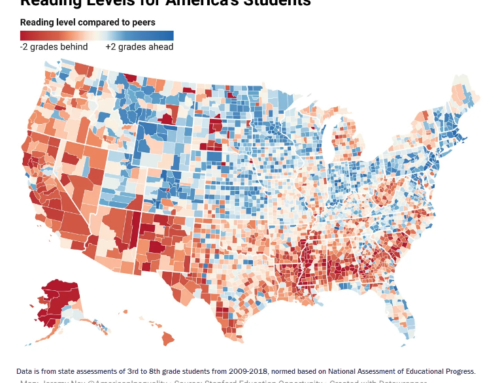
When we discuss achievement gaps or gaps in opportunities to learn, why do we represent those gaps with bar charts? It’s time for us to look at those gaps from new angles, and see if we can discover new insights. Stanford social scientists by Sean F. Reardon, Demetra Kalogrides and Kenneth Shores have already rescued us from the prison of bar charts. Are we ready to break free?
This scatterplot is a visual representation of their work, created by the talented reporting team at the New York Times, led by Motoko Rich. It uses a vocabulary to describe how students are learning that is shared by the public: grade-level. That appears on the vertical axis to the right. The horizontal axis uses Census Data to infer the average education and household of parents whose kids attend those districts’ schools.
Districts’ ethnic subgroups land in different positions on the scatterplot, connected by lines: white students are represented by pink dots, black students in green, and Hispanic/Latino students in blue. The size of each dot is proportional to the number of students it represents.
What you are seeing is Berkeley USD’s white students (pink) about 2.7 grade levels ahead of the average (and skewing far to the right of the scale toward “richer” end of the socioeconomic spectrum). Hispanic/Latino students (blue) appear 1.1 grade levels behind the average (and skew above the midpoint on the socioeconomic scale). Black students (green) appear 1.9 grade levels behind (and skew way to the left toward the “poorer” end of the spectrum). In poking around, I discovered that other university towns have a similar geometry — big vertical gaps separating students in these ethnic groups, matched by big horizontal gaps representing socioeconomic well-being.
Does this help you see achievement gaps in terms of both ethnicity and socioeconomic status? Does it help you think about the issue in a more coherent way? It sure helps me.