The serious subject of gaps has been a hot one for more than five decades. The Coleman Report of 1966 was the first moment in my lifetime when leaders shined a light on inequities in schools. Prior Supt. of Public Instruction, Jack O’Connell, ran on a platform that made gap reduction his calling card. (Did he ever admit that his class-size reduction legislation might have widened achievement gaps, as Randy Ross opined in Education Week?) Today it’s one of the three stated purposes of the new accountability system. Community advocates led by the EdTrust and their California branch, the EdTrust/West, have focused many of their efforts on gaps in opportunities to learn and gaps in outcomes.
With all that human effort invested in discussing the issue, and with social scientists participating in this education policy problem fully, a method of measuring gaps evolved which was readily accepted. It was a method which compared groups of students to each other: boys compared to girls; students getting lunch subsidies compared to those not getting them; one ethnic group compared to another.
This simple method in the hands of statisticians can render more nuanced inferences about degrees of differences. Variance analysis comes in many flavors, and it can, of course, be done better by some, and worse by others. But at its heart, it is a comparison of one entity to another.
Strangely, some policy people in the CDE decided that this widely accepted method wasn’t adequate. They invented a new approach for districts to use when writing their LCAPs. To determine if a district had a gap problem at all, LCAP teams should compare one subgroup of students to the whole (all students). See the dashboard below for evidence of this flawed guidance:
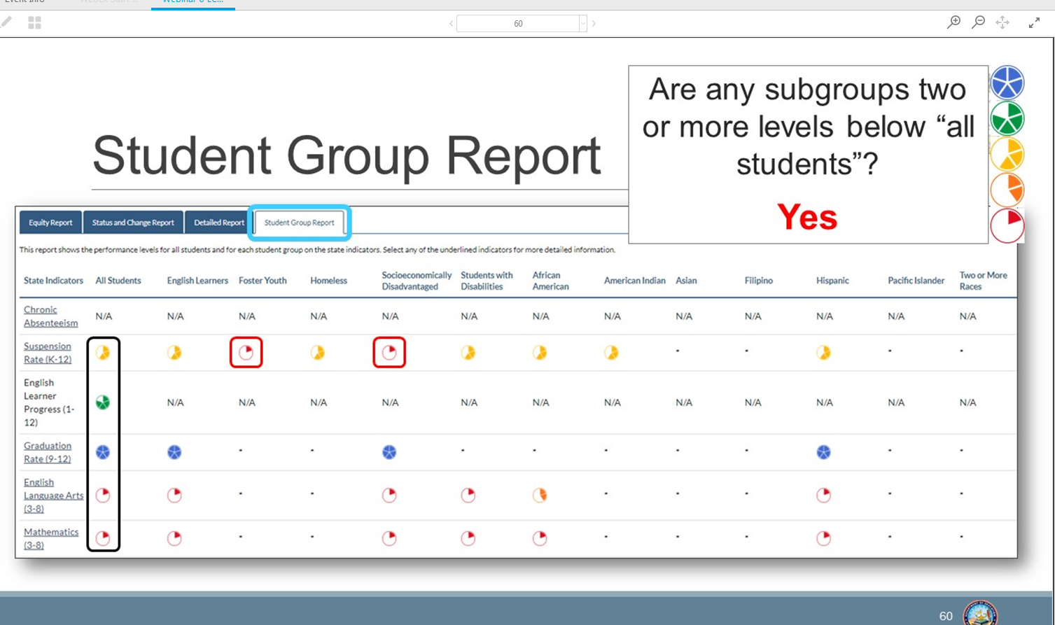
This CDE slide gives incorrect guidance to LCAP teams for identifying gaps.
The result is fatally flawed by a logic error so simple that a seventh-grade math student should spot it. (I’m relying on the seventh-grade math standards and the 12-year-olds I know.)
If you wish to measure variance, you do not compare a piece of the whole to the whole. Why? Because the piece of the whole is being compared, to some degree, to itself. The larger the piece you’re analyzing, the more flawed your exercise.
Example: If you want to learn how the graduation rate of the class of 2016 of Los Angeles USD compares to the graduation rate of all other districts in Los Angeles County, you do not take the graduation rate of LA County and compare it to the grad rate in LA Unified. Why? Because LA Unified’s 34,472 students in the class of 2016 comprise about 29 percent of the county’s 120,723 students in the same graduating class cohort.
The unwelcome consequence is that districts with substantial gap problems between ethnic groups, or between students getting lunch subsidies and those not getting them, are not likely to be flagged in Local Control Accountability Plans. As the slide from the CDE presentation shows, the subgroup must be two levels (colors) from the “all students” designation to be officially considered to be a problematic gap. (This is a false negative, in the jargon of social science. It is the failure to note something worth noting.)
I trust that wiser souls in the CDE measurement team (like Eric Zilbert) will help the policy folks see the error of their ways, and persuade them to reverse course. LCAP work began in earnest in January. Their quick response could avoid a lot of wasted time in board meetings and cabinet sessions, and spare district leaders the embarrassment of writing plans that fail to focus on real gaps that are likely to have been the topic of community conversations for years.
To read other blog posts on the errors and illogic of the California Dashboard, click here.